01 | East Falls Bridge Documentation
Project one required students to go out and visit the bridge. There we mapped out a small simplistic site-plan, drew a perspective view and take as many pictures as possible. From these pictures we were to take four different views and lay them out on a page that kept them at the same hierarchy. Then we took ten or more pictures and collaged them to make a cohesive picture that would further guide us throughout the project.

Site plan (left) and interior perspective (right)

Four different perspectives of the East Falls Bridge
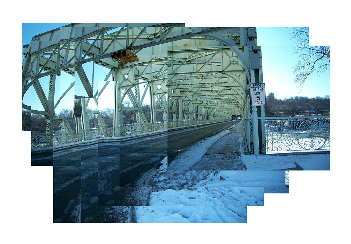
Collage of the East Falls Bridge
02 | Implied Perspectives
The goal of this project was to show an understanding of drafting and perspective through guidelines and drafting techniques. First we drafted perspectives over the two pictures and then used Photoshop to insert them on top of the phots.

The two overlays of the drafted on top of the side perspective (left) and the collage (right)
03 | Image Manipulation
In Project three we explored more of Photoshop. With these new tools we took four more images of the bridge and choose features to alter and bring out to highlight. I choose to play with the contrast in most of my pictures and then brought it out through stark contrasts with color and greyscale in some.

The four befores (left and top) and their afters (right and bottom)
04 | Analog and Digital Collages
Project four brings all our skills that we learned so far and put them into this final project. We were to take a up close photo of the bridge. Then we were to draft over it, using our best rendering techniques. After we laid them over the original photo we used Photoshop to edit the photo to highlight the drafted area and the background as well. I used the railing of the bridge because of its immense detail. I really enjoyed drawing the railing and Photoshopping it in because the detail had to be absolutely perfect.

The drawn fence over the original photo
05 | Representation of an Object: Sketched & Shaded
Project five's goal was to re-establish our eye and drawing hand. We were supposed to choose and object and then freehand draw it. I chose to draw a Logitech wireless mouse. The drawings were also supposed to be rendered and then laid out in a format on Indesign. This was our first time using Indesign.
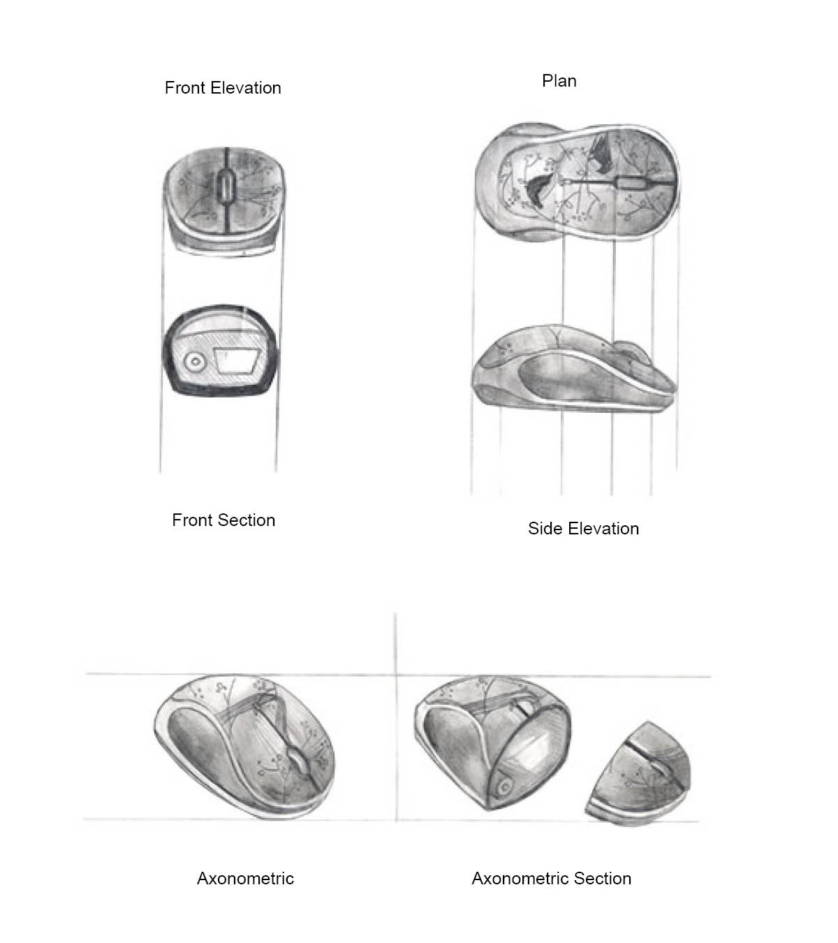
Logitech wireless mouse, freehanded and then labeled with the program Indesign
06 | Representation of an Object: Analog Drafting
For project six instead of freehand drawing our object we had to use our drafting tools to draft our object instead. After I laid out the five drawings on Indesign we also added on dimensions.

Logitech wireless mouse, drafted and labeled in Indesign
07 | Representation of an Object: Digital Drafting
In project seven we were introduced to a new program, Illustrator. Using this new project we drafted our object using line weights and drafted in guidelines. Afterwards we converted our finished renderings onto Indesign. There we began to add labels and dimensions. This project combined everything we learned so far and applying it to a new software.

Logitech wireless mouse drawn in Illustrator and labeled in Indesign.
8 | Free Swim
For the Free swim we could take any project we wanted to and re-do it. It could be a past project that maybe we weren't satisfied with that needed touching up. After we relayered the layout and put it on a document next to the original to compare differences.

Original is on the left and the modified project is on the right. Presented in the layout that was required.
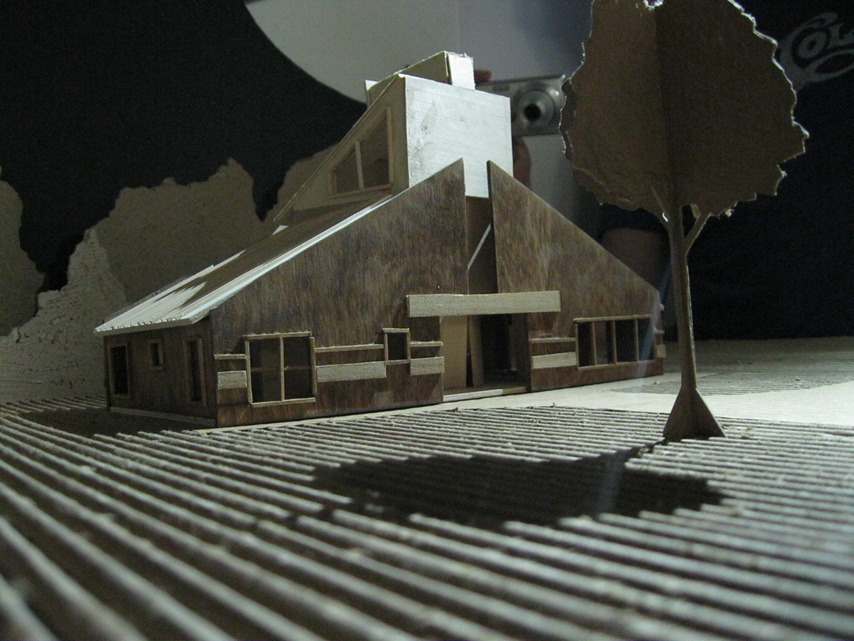
09 | Constructs
For this project we used what we learned in our Design Two classes. I took my "Vanna Venturi House" model and took several photos from its best angles. Using the stamp tools and contrast and brightness from Adobe Photoshop I was able to clean up the images in a more presentable way.


Modified picture of the "Vanna Venturi House" model. Original on the top . Modified is right above


Modified picture of the "Vanna Venturi House" model. Original on the top . Modified is right above

Modified picture of the "Vanna Venturi House" model. Original on the top . Modified is right above
10 | Instructional
For this project we got to make instructional graphics. However, not only did the craft matter but the layout of the picture also mattered. Using Adobe Illustrator and IndDesign I came up with a graphic that was layed out in a more apealing way. My poster was a comical take on how to be an architect.

Instructional graphic made in Adobe Illustrator
11 | The Barnes Foundation Documentation
This project required a site visit to Philadelphia. Here we tried to visit and reach as much as we could and as much as security would allow. We had to come up with a solid concept and portray them using Photoshop, analog drawings and a collage. My concept was Interior vs. Exterior spaces because I realized that a lot of the interior architecture alluded to the outside.

Photos Post proccessed and taken at the "Barnes Foundation Museum"
Anolog drawings sketched at the "Barnes Foundation Museum"

An Interior Collage made of "Barnes Foundation Museum"
12 | Personal Representation
This project pushed our knowledge of InDesign to the limit. In InDesign we had to make our own portfolio that reflected who we are. It reflected our ability to match fonts, sizing, coloring and many other details. The pages had to be balenced and understandable to read. We had to take a lot of time with them to make sure they were clean and to the point.

A screenshot from the Portfolio I creadted in Adobe InDesign
13 | Recover
For this project we took a book we knew well and designed the cover for it. I redesigned "To Kill a Mockingbird" by Harper Lee. This book had a bunch on symbols and things that could be well represented on the cover without giving too much away. After, we took several pictures to demonstrate the contexts it might be in. Then after post proccessing we also put it on a layout that was strong and brought out the best of our book covers.

The redesigned cover of "To Kil A Mockingbird" by Harper Lee

Pictures of the book with the redesigned cover put into context.
14 | Graphic
This project streched outr ability to research quickly and efficiently. It also tested our abiloity with InDesign. For this we had to crate a lecture poster that best fit with the poster's concept. After we figured out the names of Architects who were most likely to help and speak at the college. I choosea mix of alumni and famous architects to speak at Pratt Institute because of its eclectc nature and then choose a hyper-realistic backround similar to Pratts own style in their posters.

A lecture poster that I created for Pratt Institute using Adobe InDesign
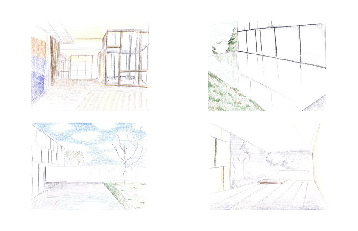
15 | Design Perspective
For this assignment we again revisited our project from Design Two. We could make whatever we felt represented our visitors center the best. I decided to create a concept poster that also represented the progression of work, and then I made a exterior view that highlighted the underground of the build. These collages were made from different medias and used many different softwares.

Concept poster for my visitors center done in Adobe Photoshop

Exterior view of my visitors center done in Adobe Photoshop

